Corporate
Brand identity
Guidelines for the EGADER logo, colours and typefaces.
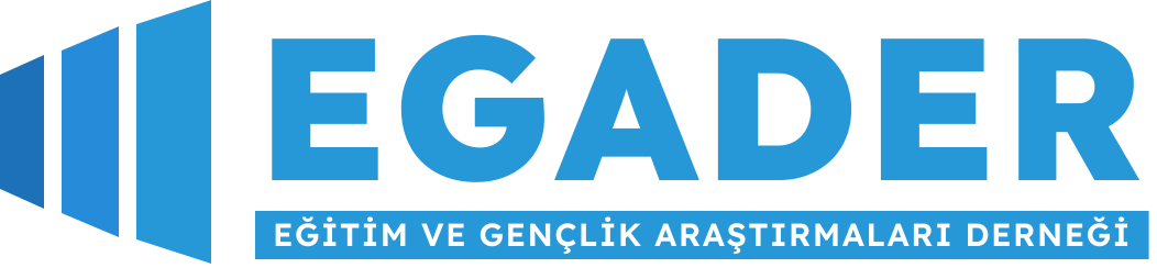
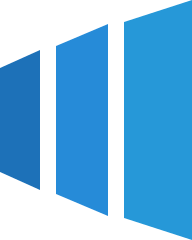
The three rising panels in our logo stand for the three stakeholders of education — students, teachers and society — and the new doors they open together. The panels grow from left to right to express development and progress.
Usage principles
- Do not change the proportions of the logo, skew it or rotate it.
- Leave clear space around the logo at least the height of the letter “E”.
- Use the white (negative) logo on dark backgrounds.
- Do not add shadows, outlines or other colours to the logo.
- In partner projects, give the EGADER logo the same visual weight as partner logos.
Colour palette
-
Deep Blue
RGB 29, 113, 184
CMYK 84, 39, 0, 28Primary colour; headings, buttons, logo panel 1
-
Sky Blue
RGB 38, 139, 216
CMYK 82, 36, 0, 15Logo panel 2, links, highlights
-
EGADER Blue
RGB 38, 152, 216
CMYK 82, 30, 0, 15Wordmark, logo panel 3, subtitle band
-
Light Blue
RGB 146, 203, 235
CMYK 38, 14, 0, 8Supporting graphics, icon backgrounds
-
Ice Blue
RGB 201, 229, 245
CMYK 18, 7, 0, 4Background areas, card surfaces
-
Night
RGB 11, 42, 74
CMYK 85, 43, 0, 71Text colour, dark backgrounds
Typography
Aa Çç Ğğ İı Öö Şş Üü
Headings and highlights · 500–800 · its geometric, wide and legible forms accompany the lettering of the logo.
Aa Çç Ğğ İı Öö Şş Üü 0123
Body text, forms and interface · 400–700 · high legibility on screen.
Graphic language: rising panels
The three panels of the logo are used as a supporting graphic in page headers, cards and presentations. The order of the panels (small to large, dark to light) is kept; scale and opacity are free.